Role: Senior Product Designer
Focus: Workflow design · Design systems · Accessibility
Timeline: 18 months
Tools: Figma, Jira, Confluence
Work / Public Health Data Platform
Overview
I led UX and UI design for a cloud-based public health platform that helped local agencies and caregivers manage programs, track data, and report outcomes. It was the kind of project where every decision mattered: complex, regulated, and used by people who needed it to just work.
The goal was to bring structure and clarity to a data-heavy environment while keeping the experience accessible and usable for everyone.
Context and Goals
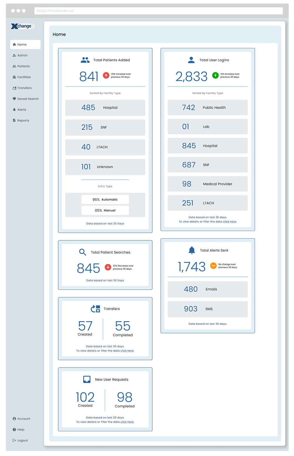
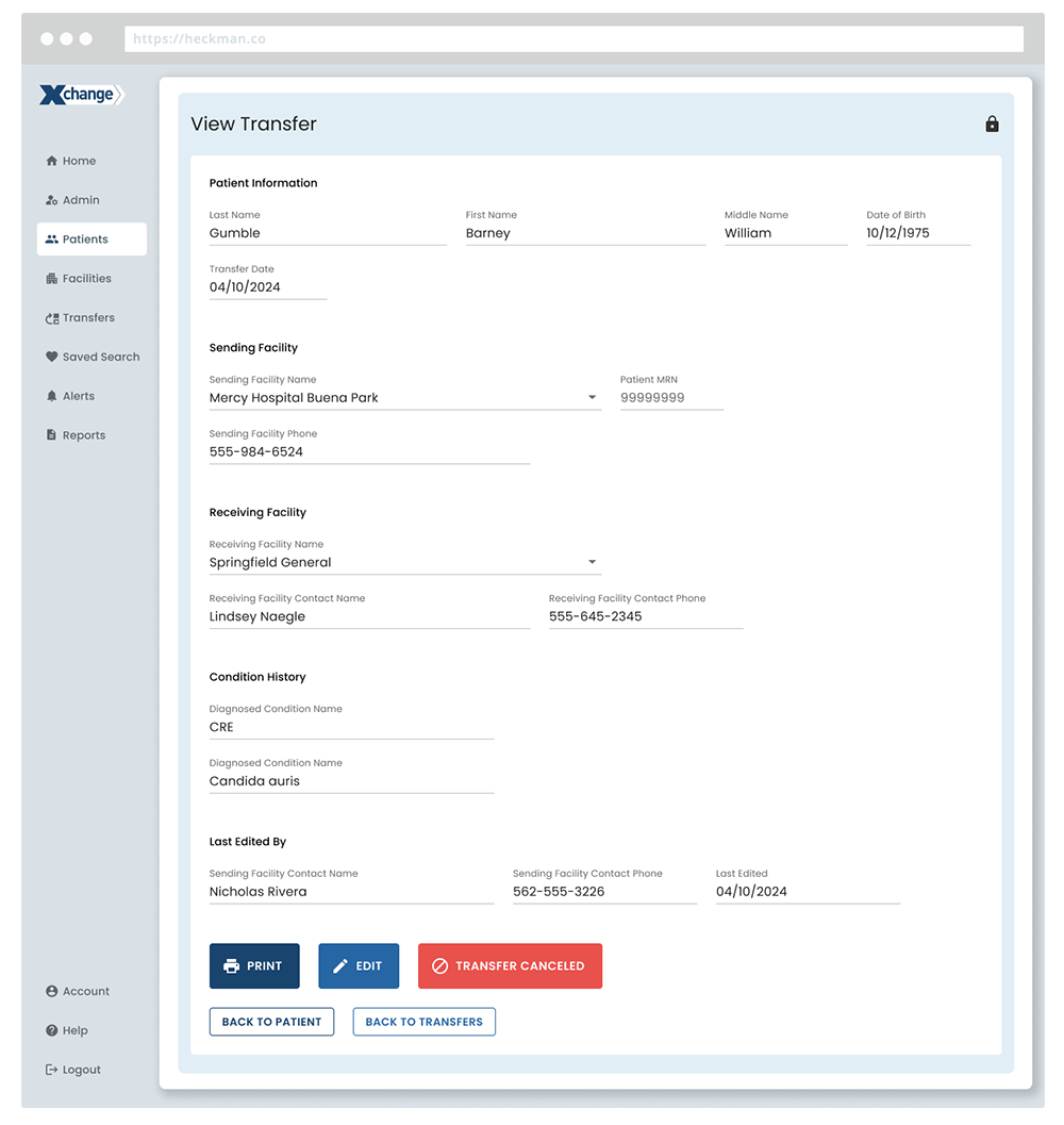
No tool like this had previously existed to give public health organizations and caregivers a clear, connected view of patient information across systems. Before this platform, there was no easy way to see history or activity between healthcare providers, which made coordination and reporting slow and error-prone.
Our goal was to unify all of that into one accessible and intuitive platform. I focused on simplifying high-friction workflows, improving data accuracy, and creating a consistent design language that held up under both compliance requirements and real-world use.
Research and Discovery
The discovery phase combined research and relationship building. I worked with program managers, analysts, and field staff to understand how they actually used the system.
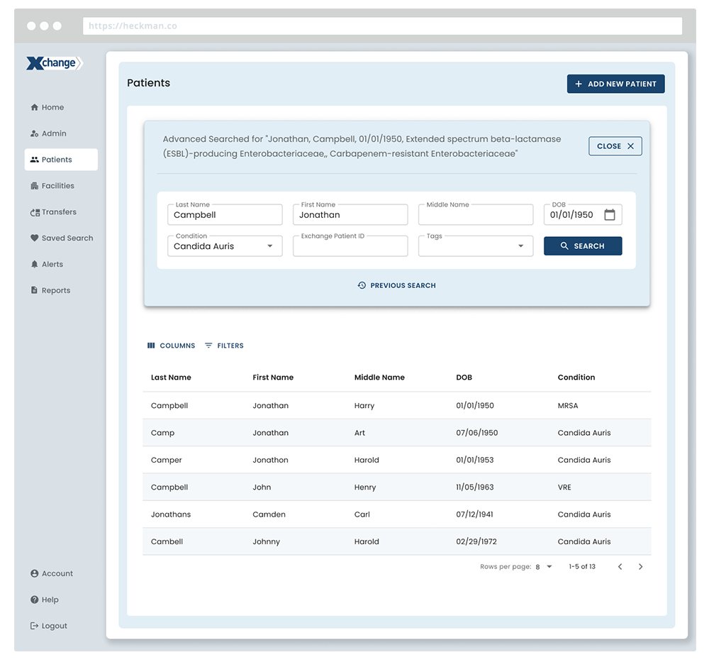
Through interviews and workflow mapping, we identified where users were getting lost: inconsistent form layouts, unclear labeling, and broken task flows. Those findings shaped our early wireframes and gave the team a clear set of priorities.
Design Approach
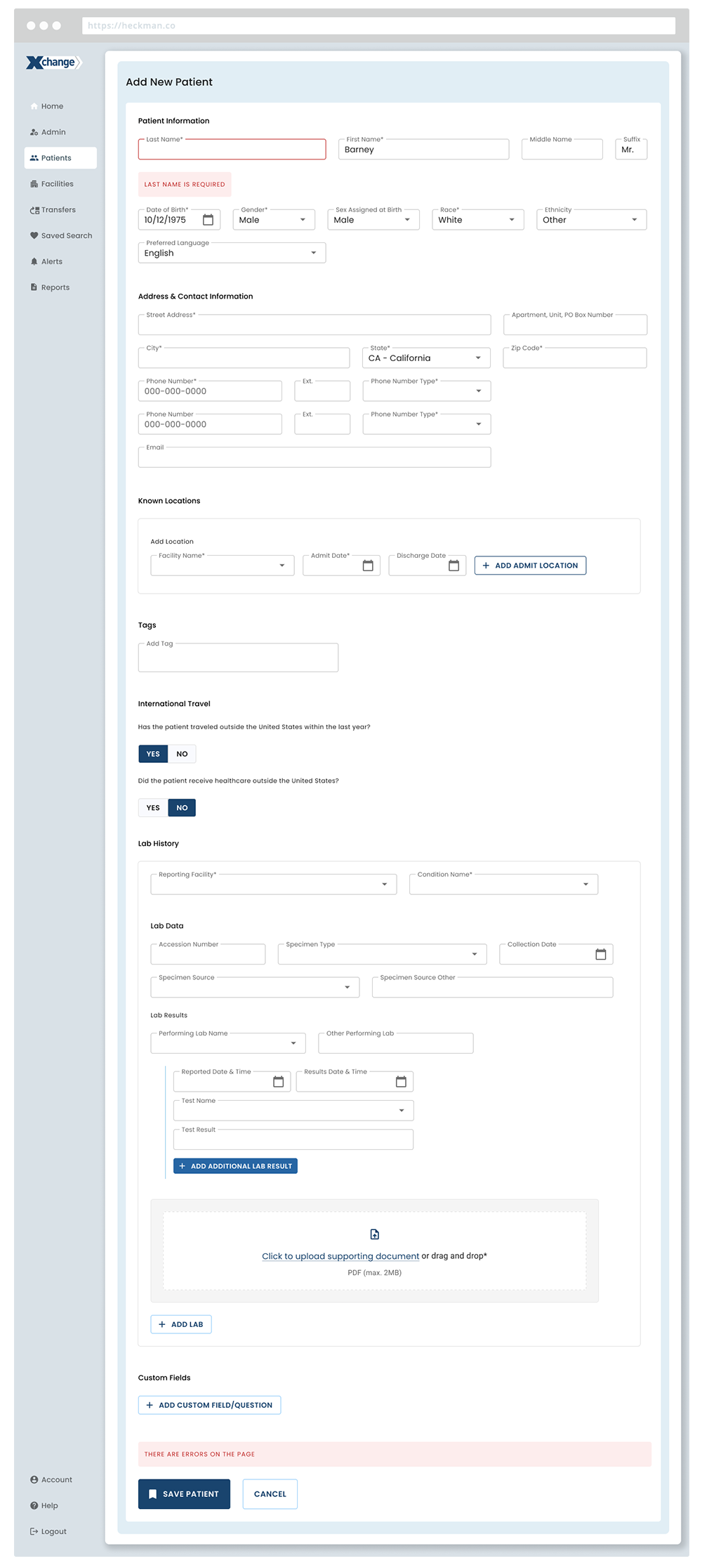
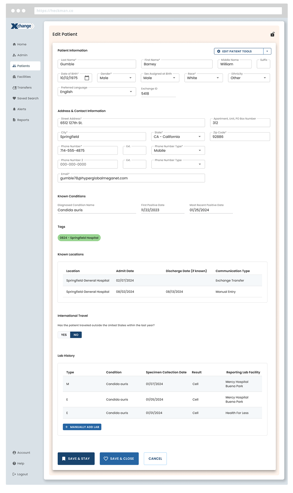
Using Figma, I moved from low-fidelity wireframes to interactive prototypes and final designs. The guiding principle was clarity: fewer steps, clean layouts, and a predictable rhythm from screen to screen.
Each iteration was reviewed with both end users and developers to ensure that what worked in design would translate to code. Collaboration through Jira kept everyone aligned and allowed us to refine interactions during implementation.
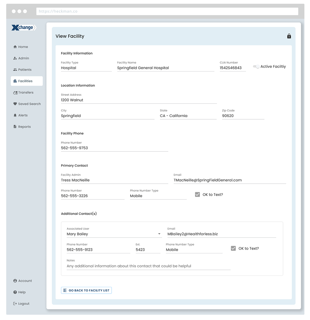
Design System Creation
As the platform grew, consistency became a major challenge. I built a design system from the ground up to unify patterns, components, and accessibility standards. The library included reusable elements, color tokens, and documentation within Figma that supported design and engineering equally.
It became more than a toolkit. It created a shared language between design and development, helping teams build faster and more confidently. The platform finally felt cohesive across modules and features.
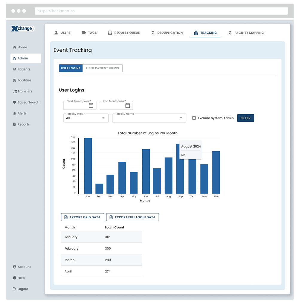
Accessibility
Accessibility was built in from the start. Every component was validated for color contrast and keyboard navigation, and all form fields followed 508-compliant patterns. We tested with assistive technologies early to confirm that the experience felt usable, not just compliant.
That attention to detail paid off when the platform passed its accessibility audit on the first review cycle.
Testing and Iteration
We ran usability reviews and scenario-based walkthroughs with partner agencies. Watching people interact with real workflows surfaced issues we could not have caught otherwise. These sessions led to improvements in spacing, grouping, and inline feedback.
The process built a strong feedback loop between design, product, and engineering. Each release cycle became smoother because the entire team understood the reasoning behind design decisions.
Outcome
The platform brought together information that had previously been scattered across disconnected systems. For the first time, public health organizations and caregivers could see complete patient histories and program data in one place.
By consolidating workflows and standardizing design patterns, we made reporting faster, more accurate, and easier to navigate. The new design system gave developers a shared framework to build from, while accessibility was built into every component from day one.
What had once taken days now took minutes. The result was a platform that not only met strict compliance standards but also made complex data feel manageable and actionable for the people using it.
Due to confidentiality, visuals have been modified to remove proprietary data, original colors, and client identifiers.