Role: Lead Designer
Focus: Mobile experience, End-to-end design, Collaboration
Work / Coupon App
Overview
The coupon app had been running on autopilot for years. It was still functional but clearly showing its age, and the experience had fallen well behind how people actually shop and save today. My team of three, including another designer and a project manager, was brought in to rebuild it from the ground up and introduce features that matched real user behavior.
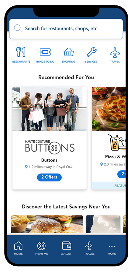
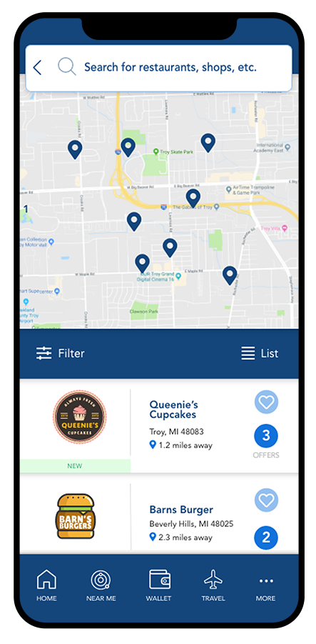
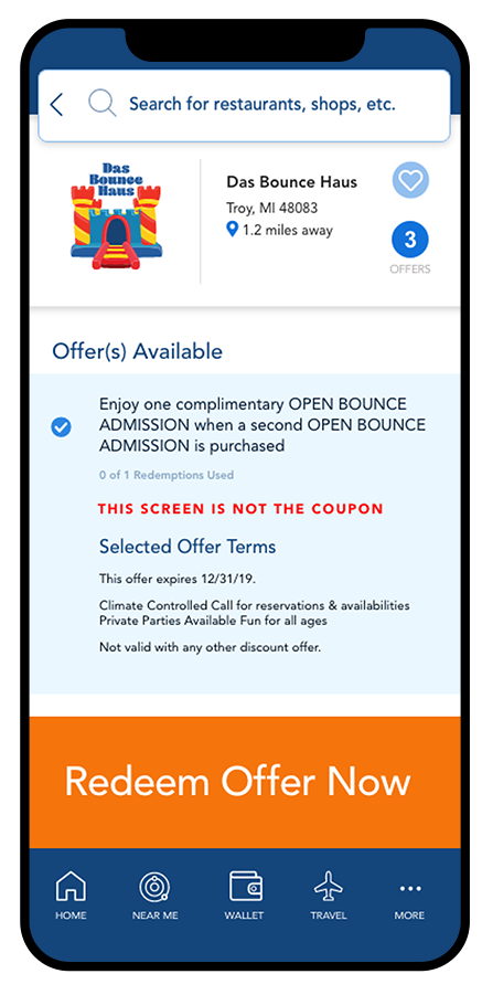
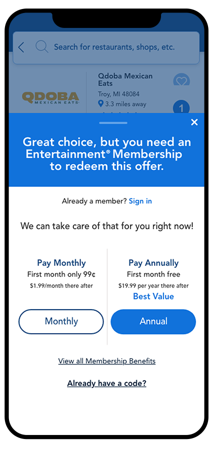
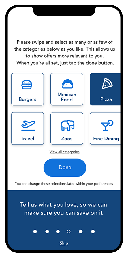
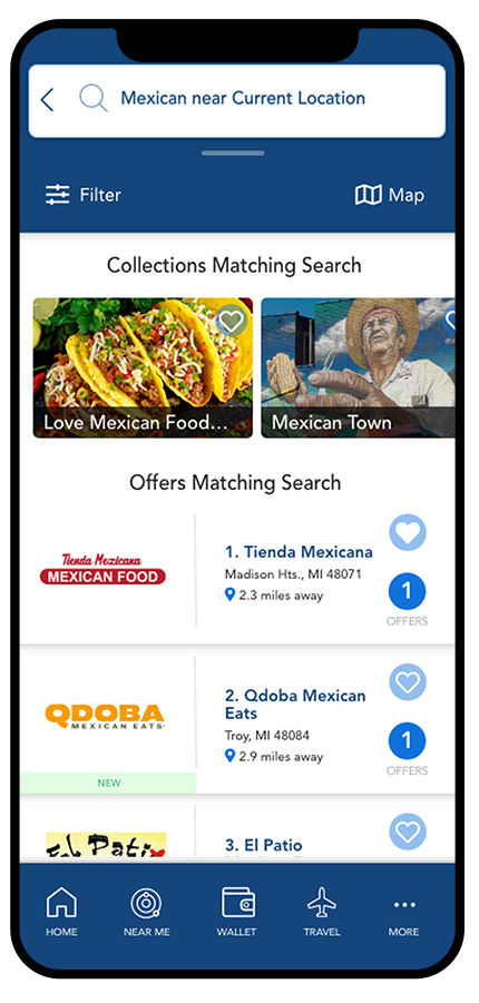
We started with user surveys and research to understand what people valued most: easy redemption, clear offers, and a clean path to savings. Over 15 months, we redesigned every flow including onboarding, login, membership purchase, favoriting, accounts, and redemption. More than 200 screens were designed in XD, complete with interactive prototypes that walked stakeholders through the complete experience.
Context and Goals
The existing app was functional but structurally outdated. Navigation was unclear, offers were hard to organize, and merchants had almost no visibility within the experience. Users had no good way to save or track what they wanted.
The goal was to rebuild the app around two core insights from research: merchants needed to be more prominent throughout the experience, and users needed better tools to organize and act on offers. Everything we designed flowed from those two things.
Design Approach
We worked from early concepts through wireframes, interactive prototypes, and final high-fidelity designs across every screen in the app. The design system was built alongside the product, establishing consistent patterns for navigation, offer display, redemption flows, and account management that held together across more than 200 screens.
The process was iterative and collaborative. Stakeholders were brought in regularly through prototype walkthroughs, and feedback was incorporated across multiple rounds before anything was considered final.
The Ending and What Shipped
The day before launch, new management ended the project. In that meeting, I proposed salvaging the checkout flow and moving it into the existing app. The old checkout was genuinely broken: a 12-plus step process that sent users to external websites, required email verification codes to be copied back into the app, and routed payment through systems outside the app entirely. It was the kind of flow that existed because no one had fixed it, not because it made sense.
The new checkout was exactly what any user would expect: enter your payment details in the app, hit submit, and get access. That proposal was approved and the checkout shipped in the existing app, replacing the old flow entirely.
Outcome
The full app rebuild didn’t launch, but the fix to the most broken part of the original experience, the checkout, shipped. Conversion improved. The design system, interaction patterns, and documentation built across 200+ screens became a reference for future mobile work and demonstrated what the product could have been.