

Role: Sole Designer
Focus: Workflow design, Design systems, Accessibility
Work / Public Health Data Platform
Overview
I led UX and UI design for a public health platform that gives local agencies and caregivers one place to track multidrug-resistant organism (MDRO) cases, manage programs, and report outcomes. No tool like this had existed for these teams before. The work was about bringing structure and clarity to an environment where the workflows were genuinely complex, the users were stretched thin, and getting things right is critical.
Context and Goals
Before this platform, there was no connected view of patient information across systems. Coordination between healthcare providers was slow and error-prone, often meaning phone calls to individual facilities, and reporting required significant manual effort. The goal was to put all of that into one accessible, usable platform, simplifying high-friction workflows, improving data accuracy, and creating a design language that held up under both compliance requirements and real-world use.
I was the only designer on this project. Every design decision, from early research through final UI, was mine to make and defend. Altarum had never had a designer before me, so the work also meant setting the design standard and regularly pushing engineering to drop long-standing patterns that didn’t serve users.
Research and Discovery
The discovery phase was equal parts research and relationship building. I worked with program managers, analysts, epidemiologists, and clinical staff, including nurses and doctors, to understand how they actually used the patchwork of tools each facility relied on and where things fell apart. Through interviews and workflow mapping, we identified the real problems: tools that didn’t talk to each other, data that relied on manual updates and phone calls, inconsistent form layouts, unclear labeling, and task flows that just didn’t work. Those findings shaped the early wireframes and gave the team something concrete to align around.
Designing for Shared Records
A patient’s history could span several facilities, with staff from each one, along with public health, working from the same record. That shaped three decisions.
First, nobody needed all of it at once. I broke patient data into distinct sections that can show more or less detail, so what each role reached for first stayed on the surface and the rest stayed one step away.
Second, a shared record can’t mean anyone can change it. Patient data defaulted to read-only, so no facility could overwrite another facility’s record or change data that shouldn’t move.
Third, access had to match responsibility. Tiered, role-based permissions let higher-access users approve changes, all designed within HIPAA constraints.
Design Approach
I moved from low-fidelity wireframes through interactive prototypes to final designs, with one guiding principle throughout: clarity. Fewer steps, clean layouts, a predictable rhythm from screen to screen. Each iteration was reviewed with end users and developers to make sure what worked in design would actually translate to code. Jira kept everyone aligned and gave us a way to work through implementation details without losing track of decisions along the way.
Design System
Before any screens were designed, I built the design system: patterns, components, accessibility standards, color styles, and Figma documentation. All of it was established upfront so every design decision that followed had a consistent foundation to build on.
Engineers could pull components and move forward without stopping to ask how something should look or behave. The decisions were already made and documented.
Accessibility
Accessibility was built in from the start. Every component was validated for color contrast and keyboard navigation, and all form fields followed WCAG and 508-compliant patterns. I checked key flows with assistive technology along the way and worked with engineering to review compliance before each release. I also wrote the interface copy in plain language, so labels, errors, and help text worked for everyone from epidemiologists to nursing home staff.
Testing and Iteration
Validation happened through steady contact with the people using the platform. I met with client staff, including epidemiologists, twice a week, and ran workshops and structured design reviews with partner agencies. Those conversations kept the design grounded in how the work actually happened. Each release cycle got smoother because the whole team understood the reasoning behind design decisions, not just the outcomes.
Outcome
The platform brings together information that had been scattered across disconnected systems, giving public health organizations and caregivers one place to see patient histories and program data.
The design system gave developers a shared framework from day one, and the accessibility work passed QA’s audit on the first review cycle, a result of treating accessibility as part of the design process rather than something to fix at the end.
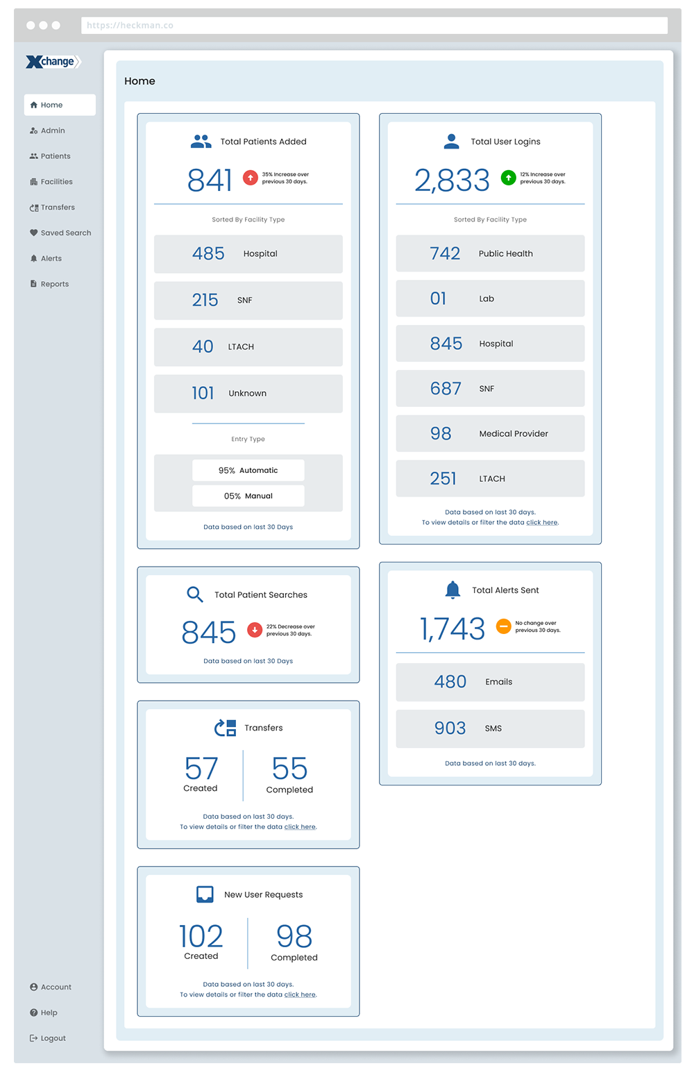
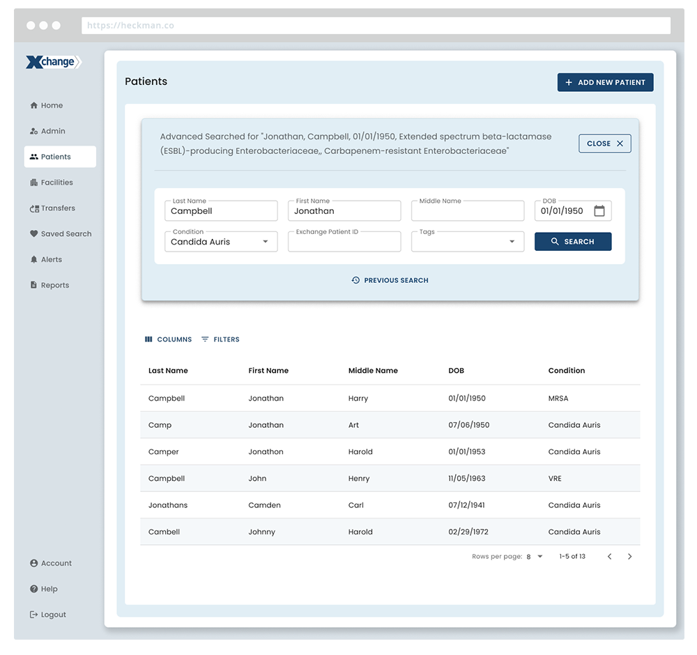
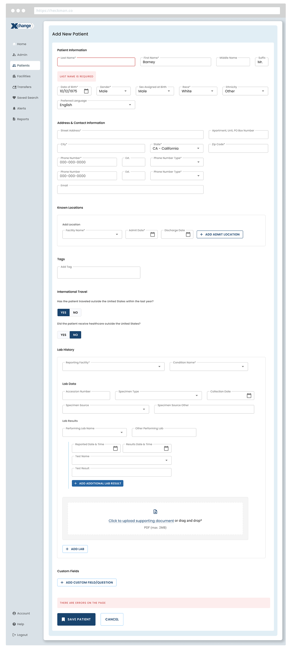
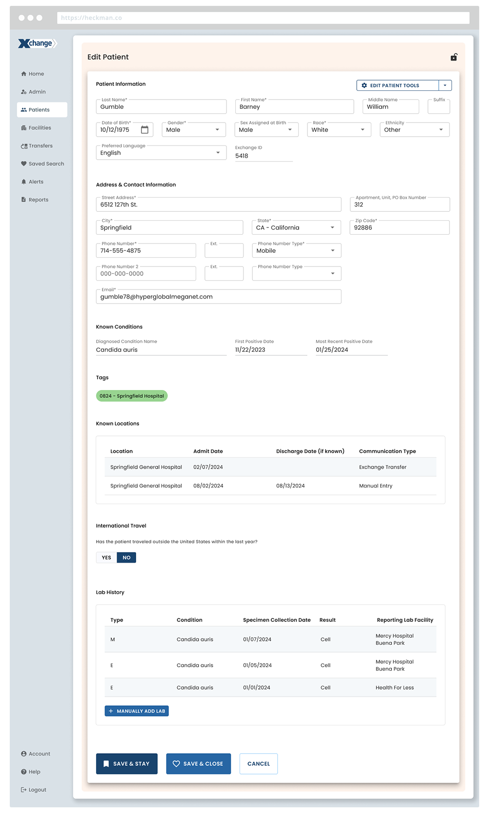
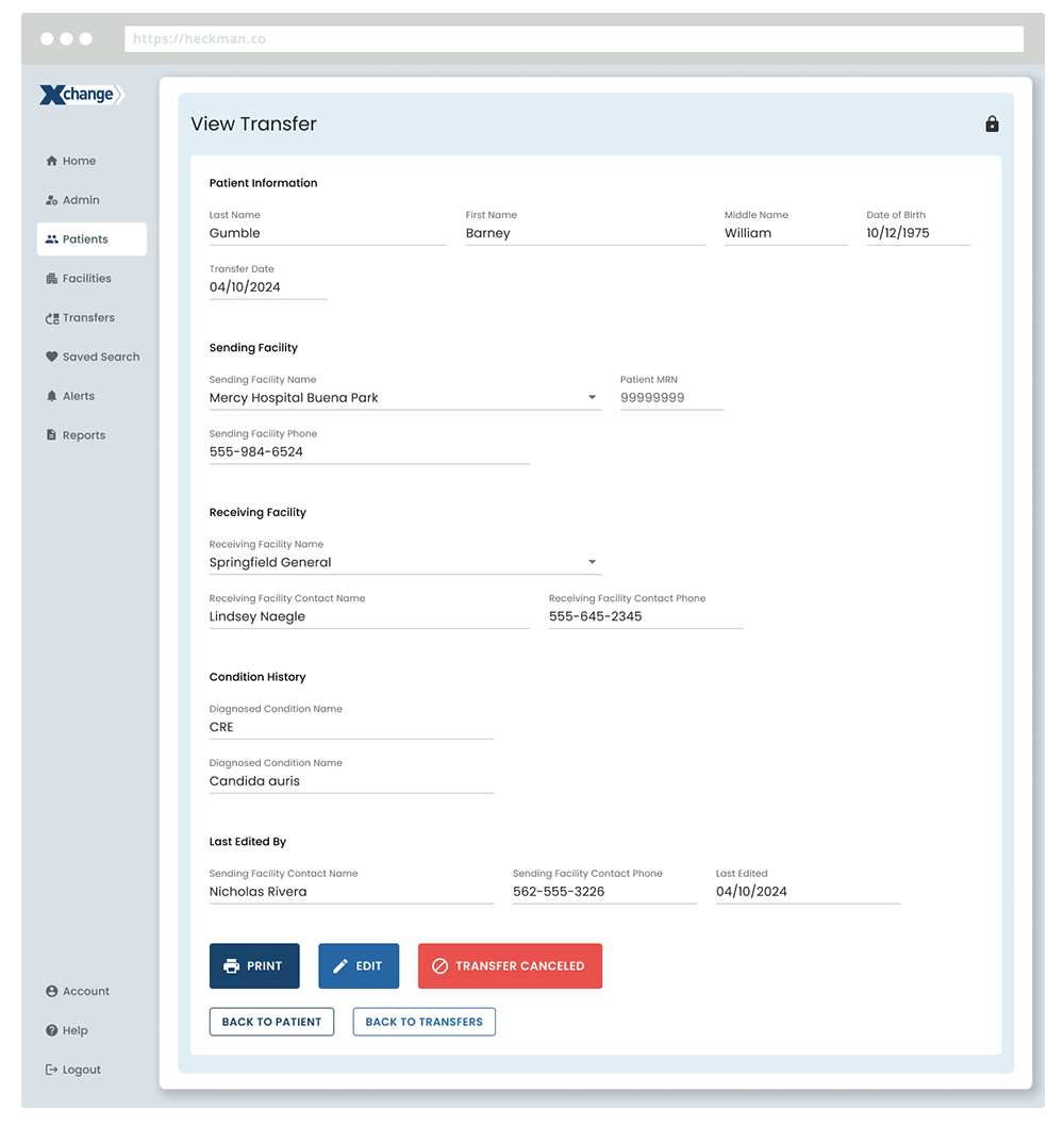
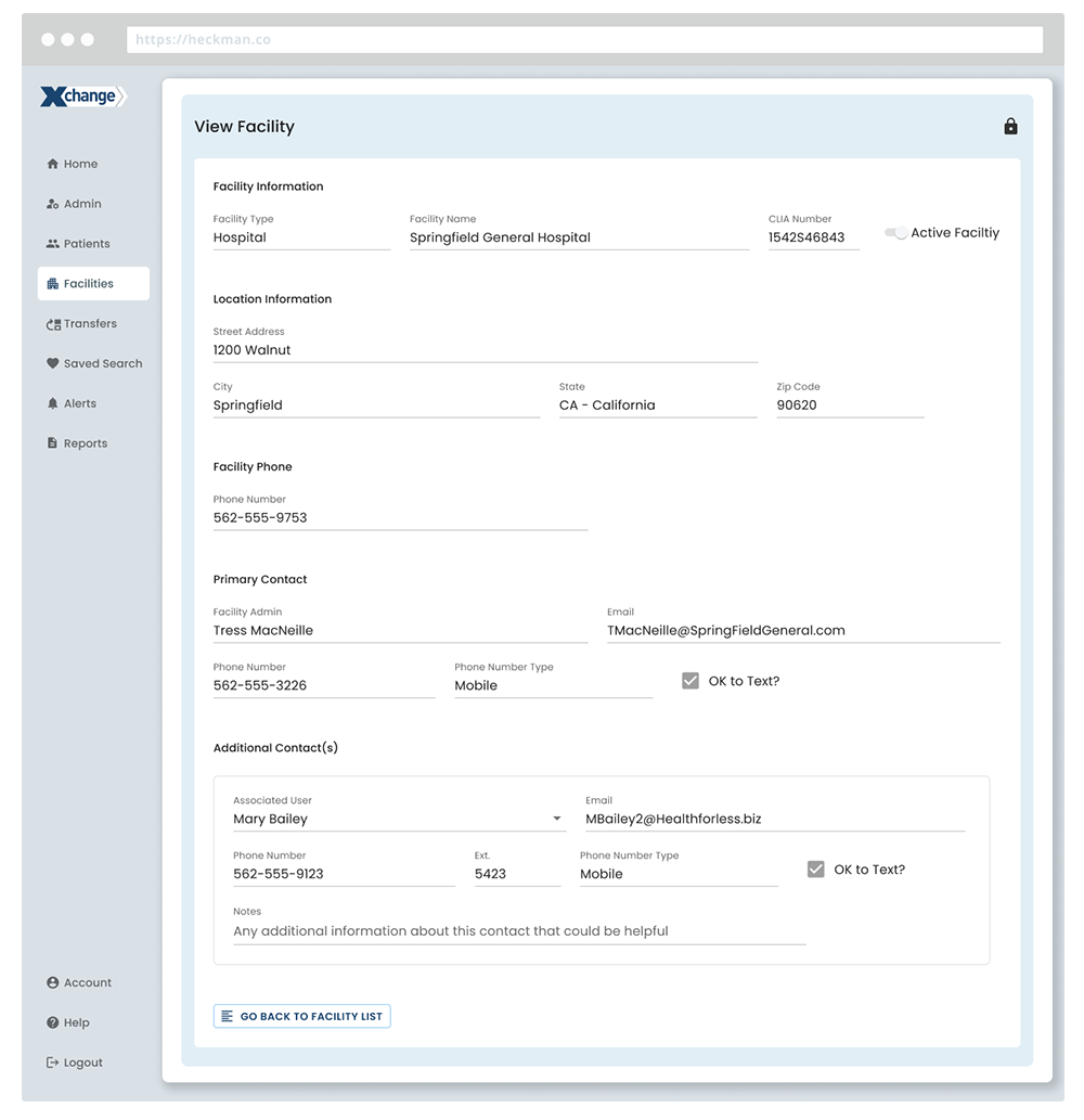
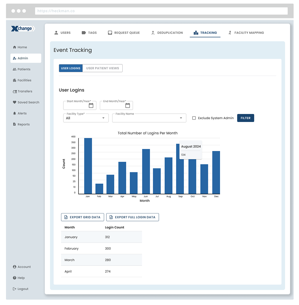
Due to confidentiality, visuals have been modified to remove proprietary data, original colors, and client identifiers.